The Problem
Despite healthy sales, the existing PDP worked against the brand's transparency value — customers landed and left without the confidence to buy.
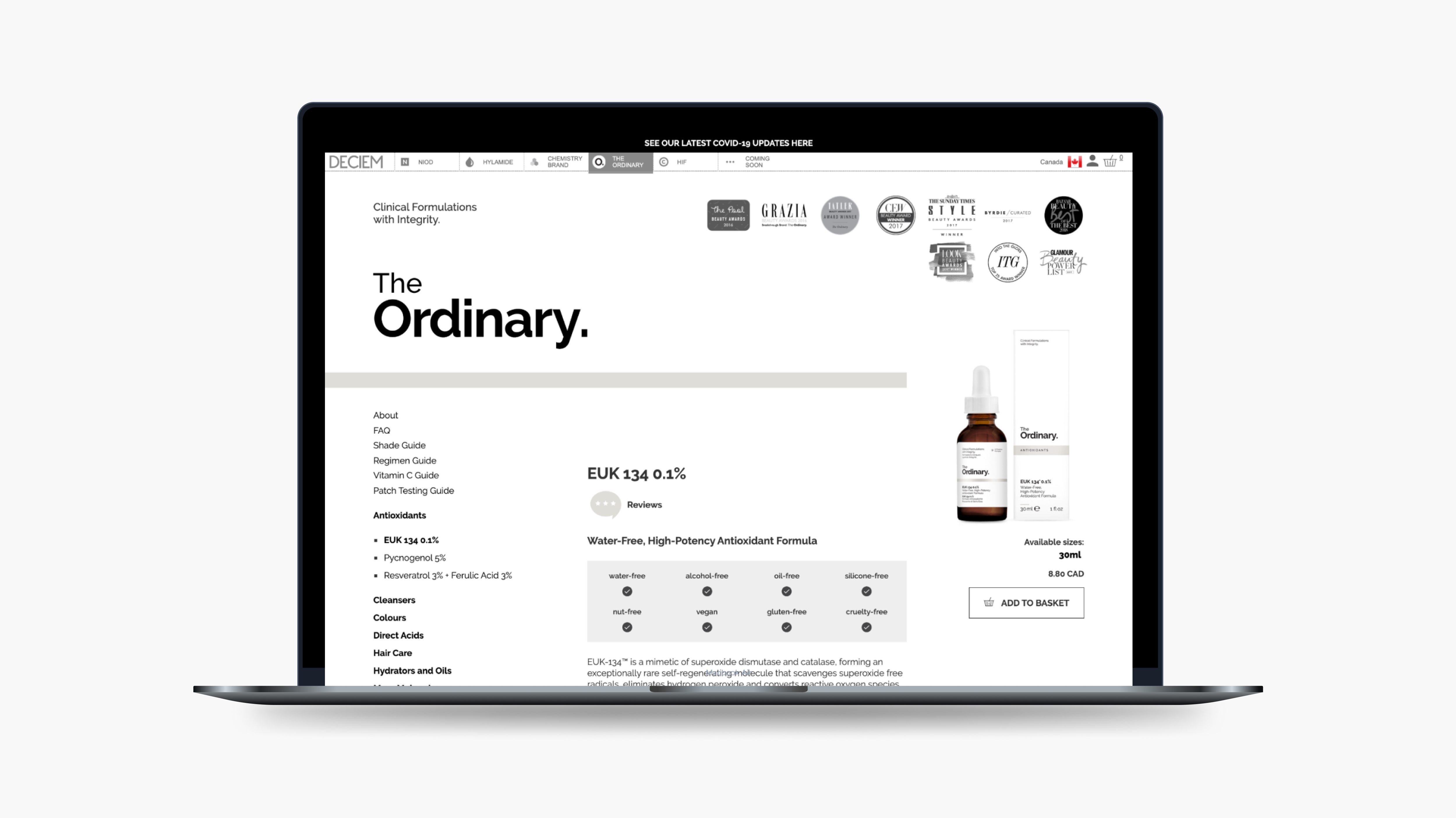
Before
Directive
The UX team received insights from the Customer Happiness team regarding the Product Description Page — customers couldn't find what they needed on the site. With the CHT fielding simple inquiries, they were being pulled away from strategic work that mattered. Data confirmed it: despite healthy sales, our Add to Basket rate was significantly below the industry average, telling us customers wanted the product, but the PDP was getting in the way.
As design and research lead, I owned the process end-to-end — from discovery through final screens — and built out the design system components to support the new PDP patterns, ensuring what we shipped could scale across the product. The screens below represent key moments in that journey, each a direct response to what we heard in research.
Results
Despite healthy sales, the existing PDP worked against the brand's transparency value — customers landed and left without the confidence to buy.
Before
Discovery
I led our team through discovery and usability testing with 30 participants — new, lapsed, and repeat customers — walking each through the existing PDP to see if they could confidently buy.
Users weren't confused by the brand — they were confused by the information architecture. The page was burying the very details people came to find.
"All these words here (under Technology), I just skim over; it's all a bunch of jargon."
Discovery participant
I turned a two-day workshop into a Customer Journey Map, then ranked pain points by frequency and severity. Product Evaluation — the PDP — had the heaviest cluster: missing imagery, then unclear regimen fit, then ingredient jargon — the order behind Images & Video, Product Attributes, Shop by Regimen, and Key Ingredients.
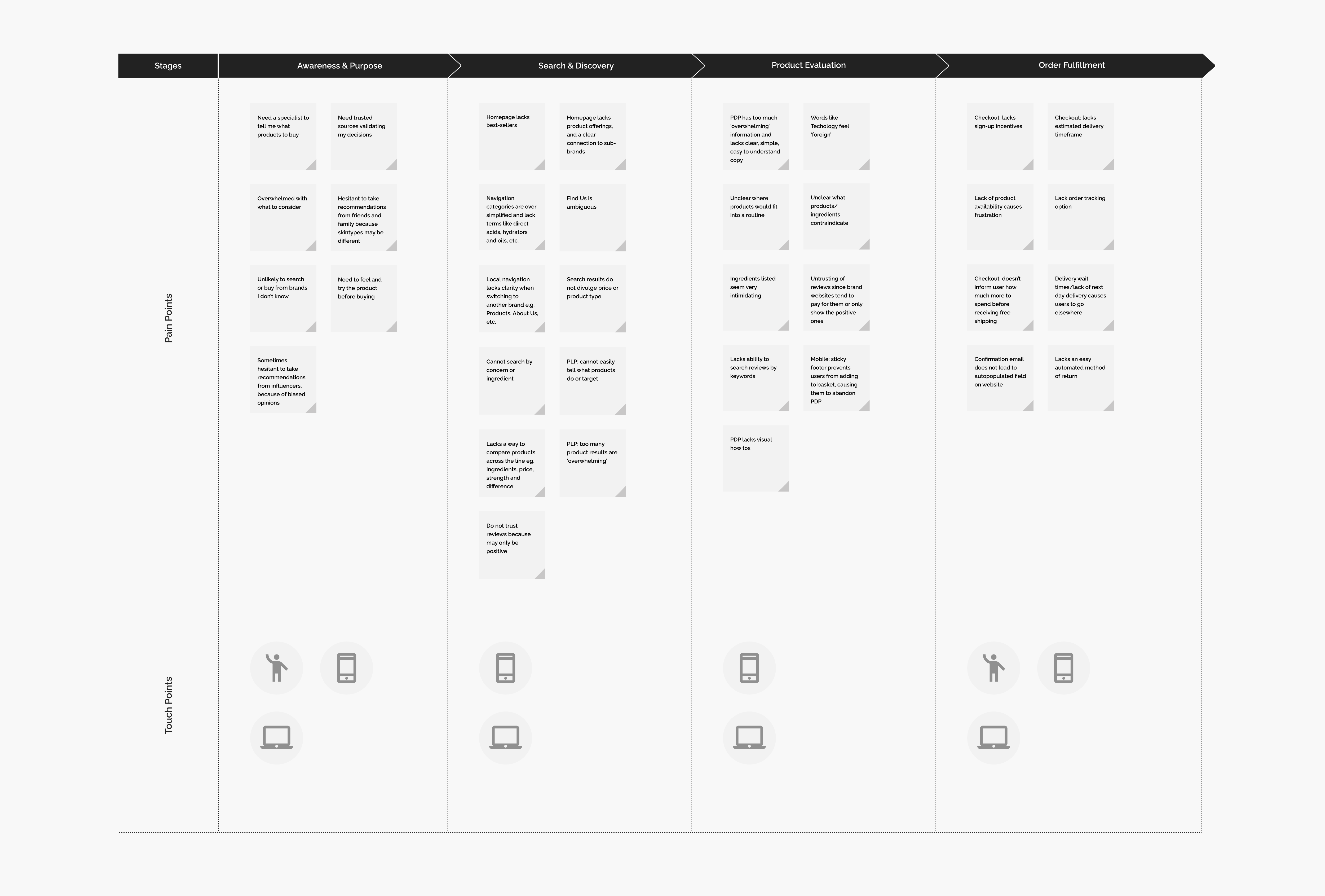
Customer journey map
These later-stage concept frames were pressure-tested across two rounds of usability testing with our original discovery participants — the same people who'd flagged the problems. We cut concepts that looked right on paper but confused users in session.
Late-stage concept frames
Final Design
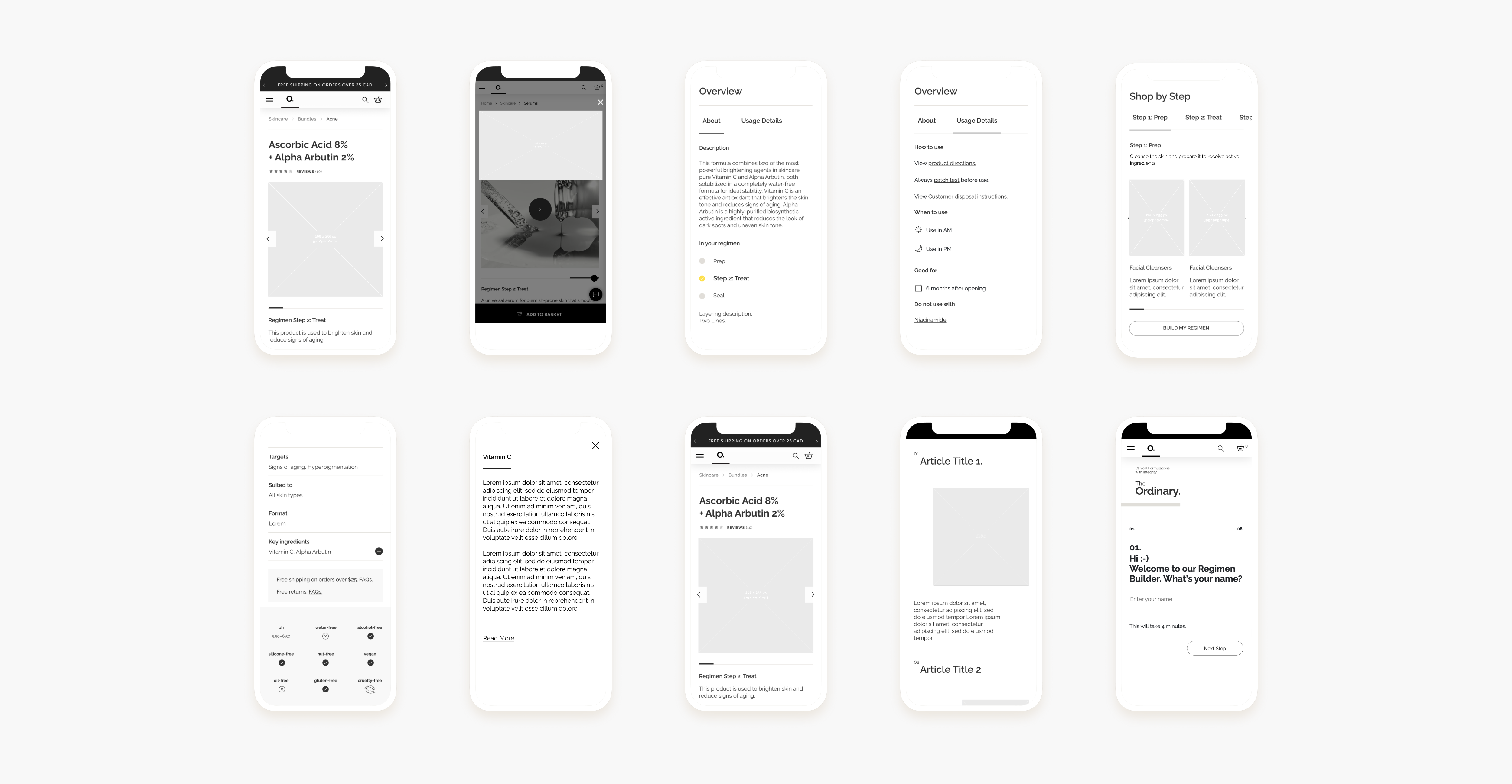
Four components that moved the most meaningful needles — each validated through testing before handoff to engineering.
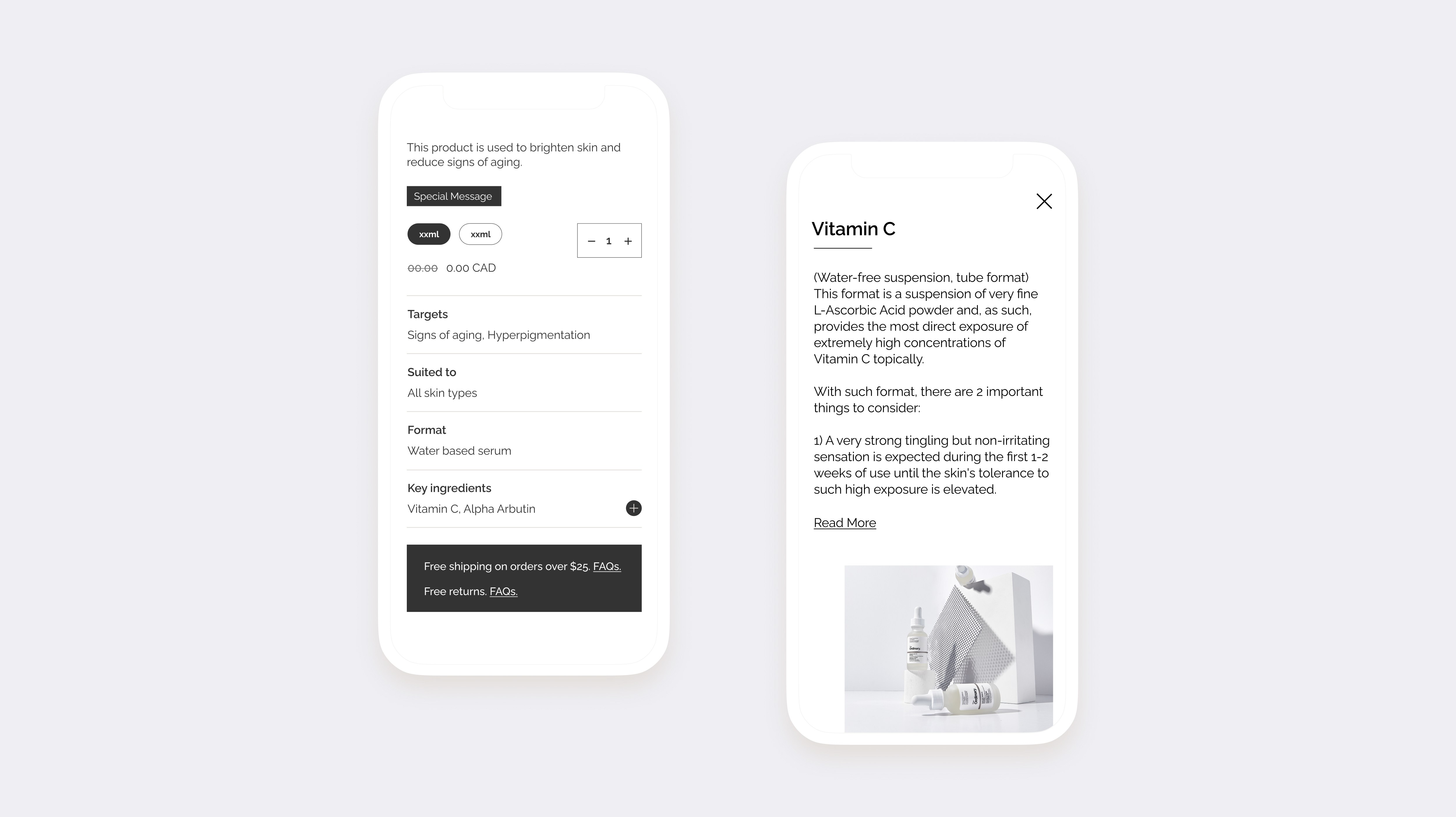
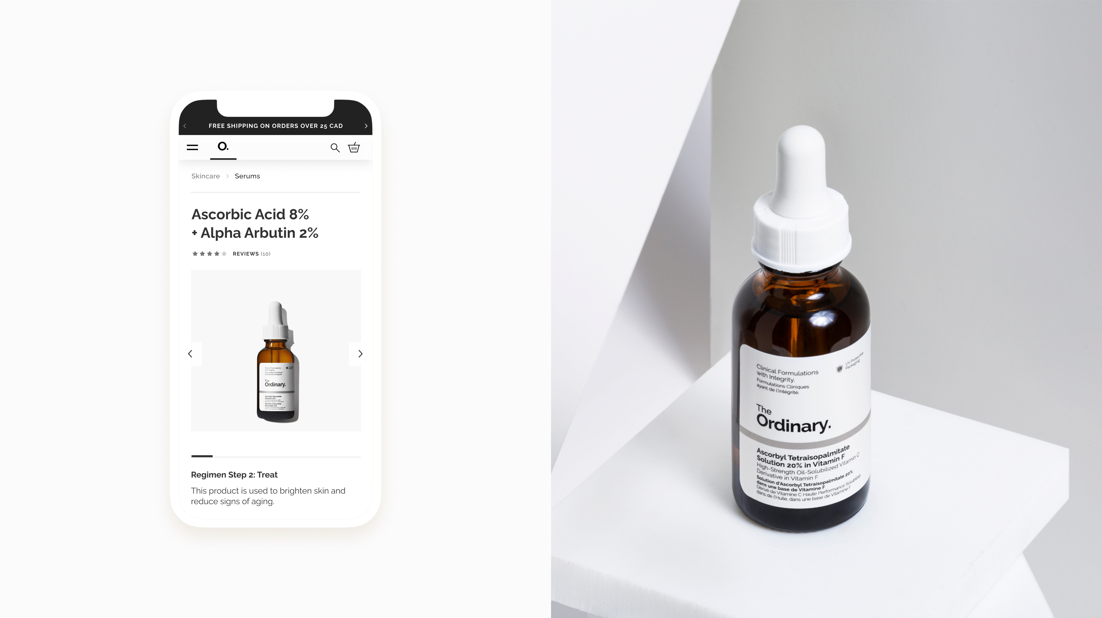
I moved images and instructional video to the top of the PDP — the most requested attribute in testing, and the single highest-impact change from research.
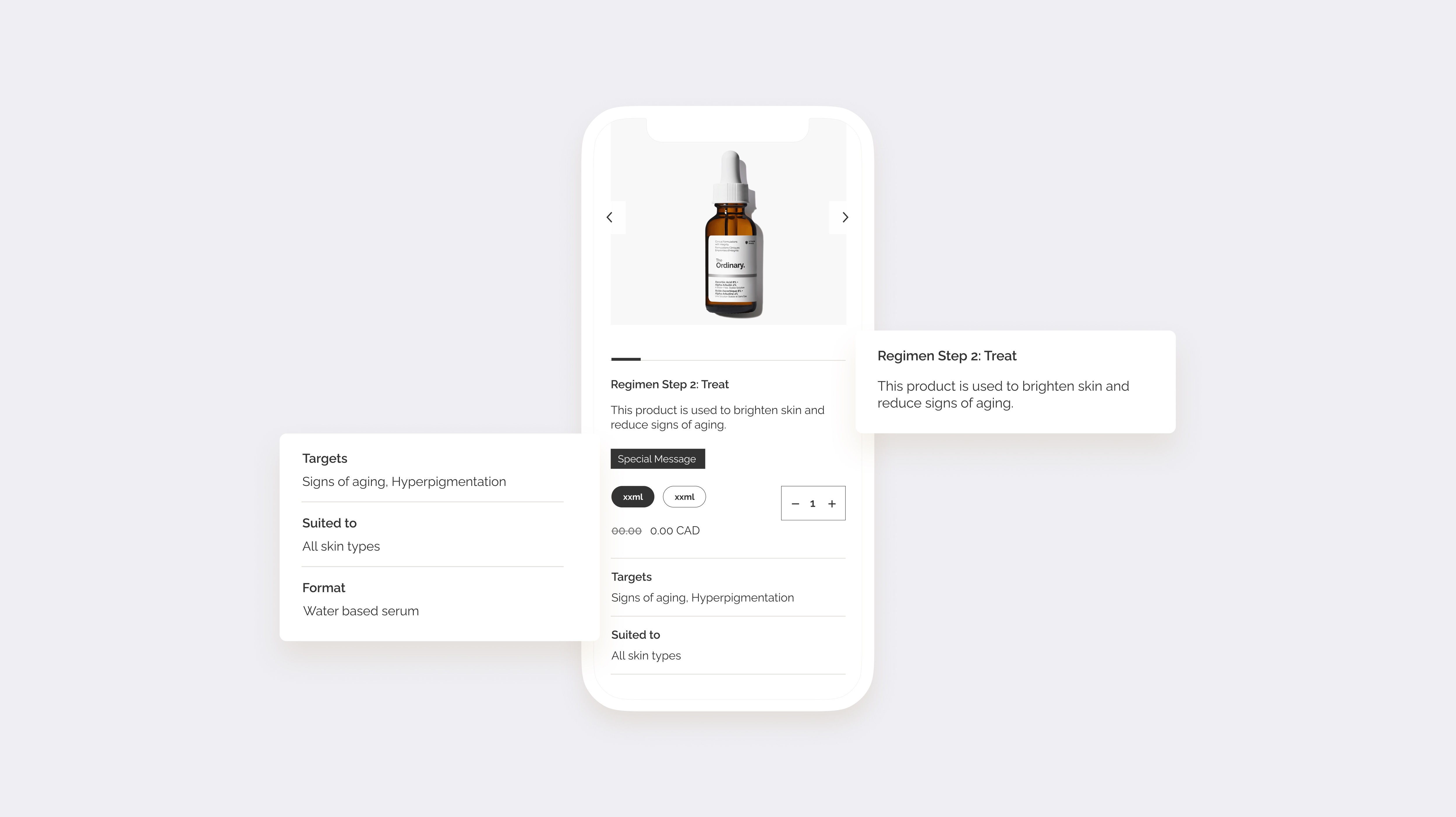
I designed this module to surface the product's regimen step and usage details — answering the two questions users struggled with most: where does this fit, and how do I use it.
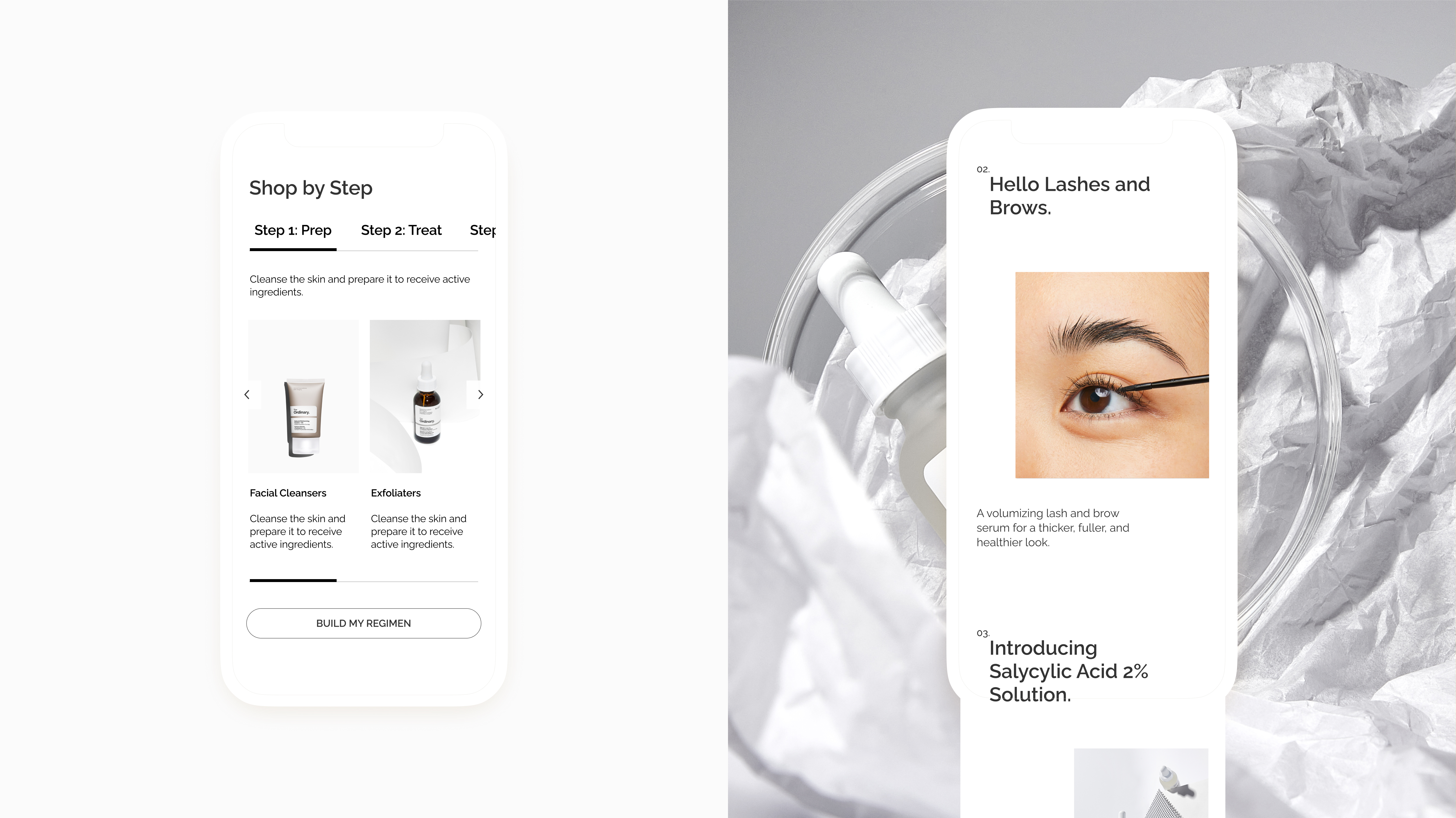
I built Shop by Regimen as a reusable design system component, so every PDP shows exactly where a product fits — each step expandable for more context.
I designed the expandable Key Ingredients format to cut through the "jargon" complaint — plain-language explanations for what each ingredient does and which to avoid.