Inspection
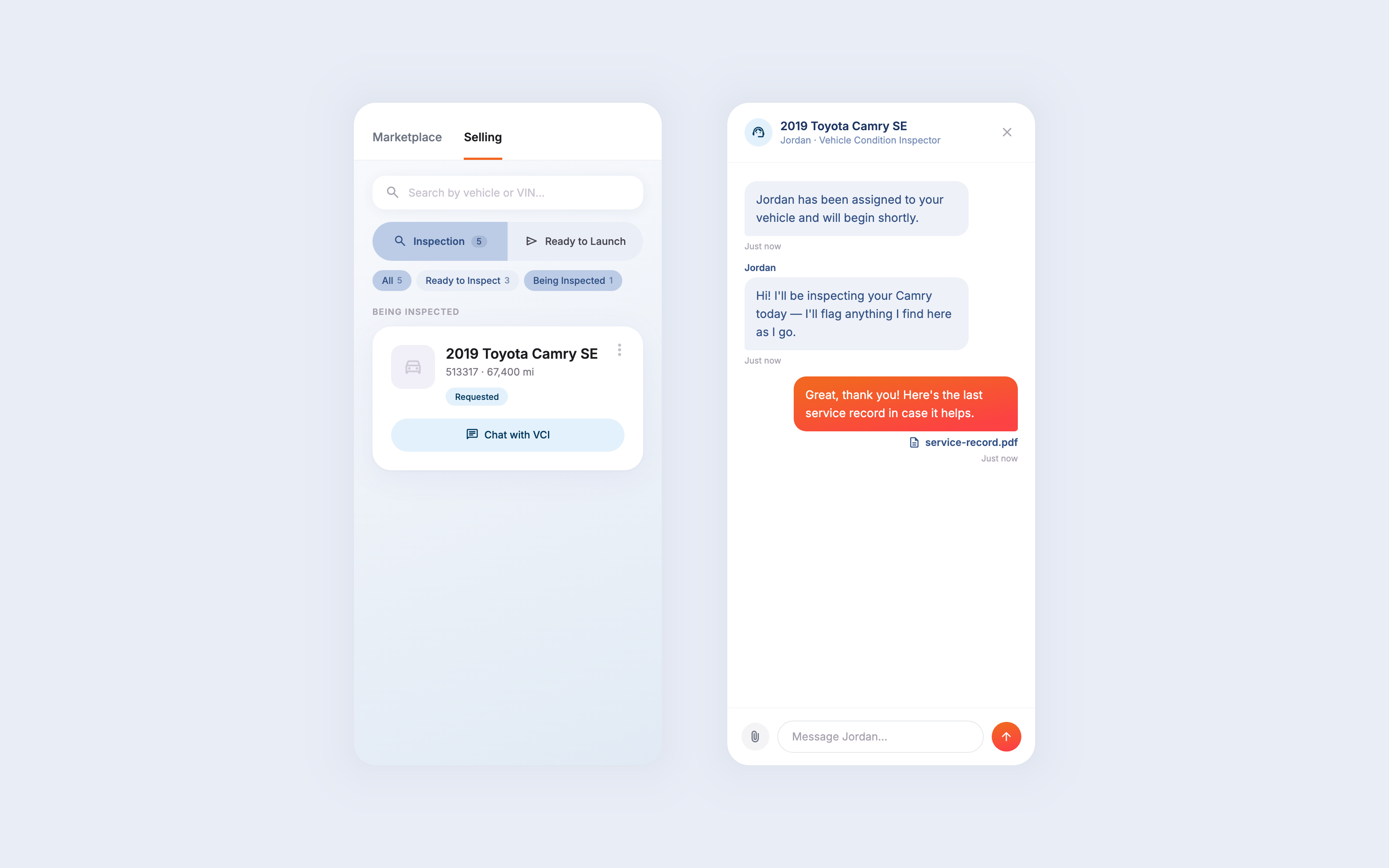
In the new design, sellers see the moment a VCI is assigned, message them directly, and attach documents like service records right from the chat — no phone call required.
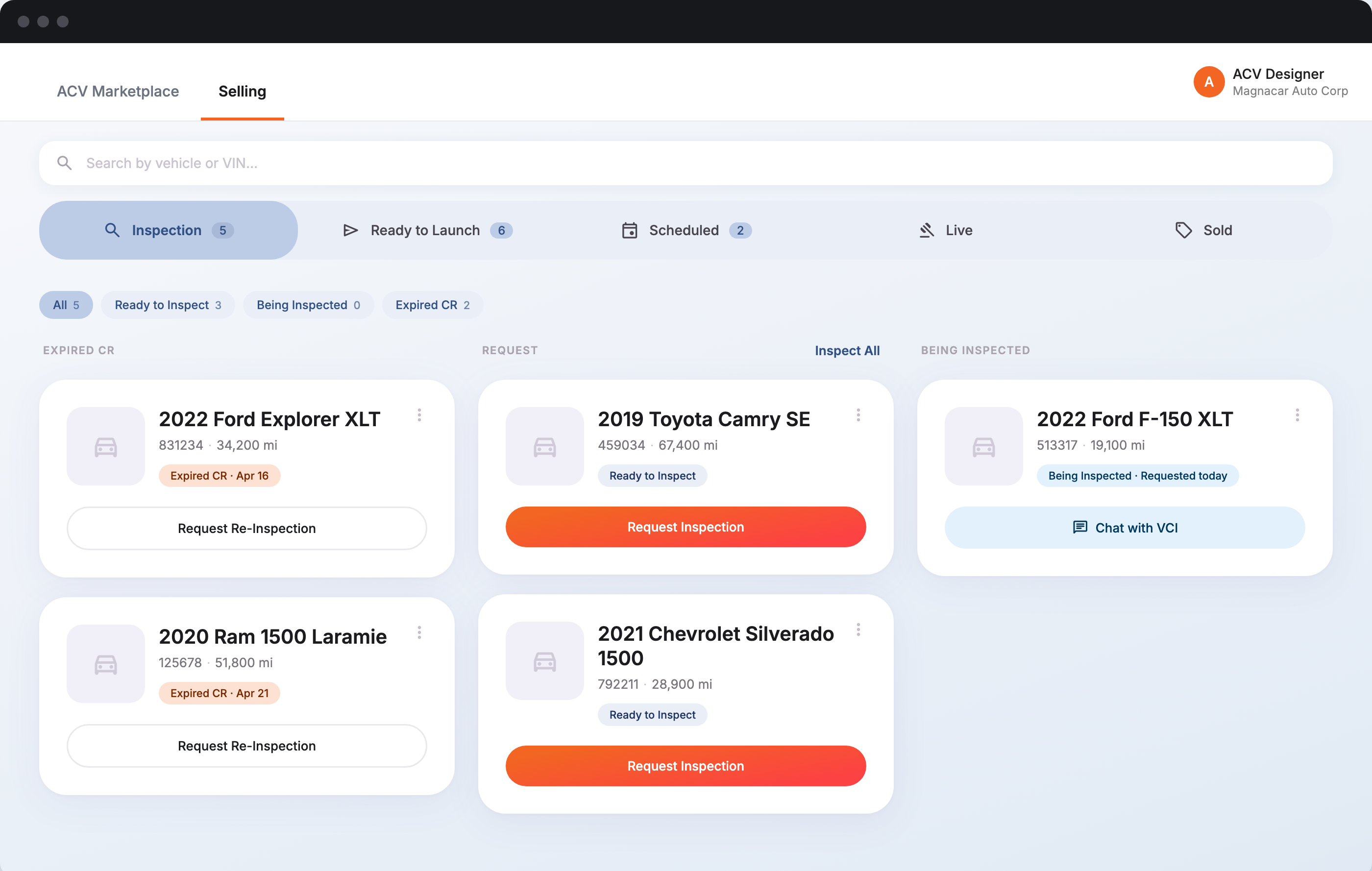
Final — Seller Control Room
Directive
Sellers were juggling a multitude of actions and decisions — requesting and monitoring inspections, pricing, launch timing, traction metrics — inside a fractured experience. I led design and research on a full marketplace designed around a central idea: one consolidated space to see every vehicle's status, and know exactly what to do next and why.
Discovery & Synthesis
I ran discovery interviews with 5 certified independent dealers — sellers who manage their own inventory with no back office to lean on — to understand their needs directly rather than assume them. We walked through their day, from inspection to tracking a sale, to find exactly where the friction sat and where the redesign needed to focus.
Here's what surfaced, stage by stage:
"If I don't know why the number is what it is, I'm not going to trust it enough to launch on it."
Independent dealer, discovery participant
Framing & Concept Testing
Every action — from inspection through to sold — exists in the old tool. However, users were forced to sift through nested navigation items, locate vehicles that needed attention in long inventory lists, and guess at which ones had status updates. Dealers also had to navigate buying activity in the same tab group, which interrupts the sales flow of their vehicles.
I tested a flat tab system and confirmed dealers could immediately spot what needed their attention. I also parked the buy experience exclusively in the marketplace, so dealers manage purchase activity separate from their sales inventory, and built it mobile-first, since dealers check this on the go.
Before — stages buried in nested tabs
Tested — stages, one flat tab row
Another example — Ready to Launch
Sellers had no real-time signal on the card for when the market favored launching. I used AI to wireframe and test dozens of concepts against that finding. An early version hid that signal behind a tooltip — sellers wanted to scan and compare it at a glance, not click to reveal it — so the final surfaces it directly.
Tested — signals in tooltip
Final — signals surfaced directly
Final Design
Once testing validated the direction, I moved from concept to refining the UI to address what we'd learned. What follows isn't a hypothesis anymore; it's what sellers actually needed to do their job.
In the new design, sellers see the moment a VCI is assigned, message them directly, and attach documents like service records right from the chat — no phone call required.
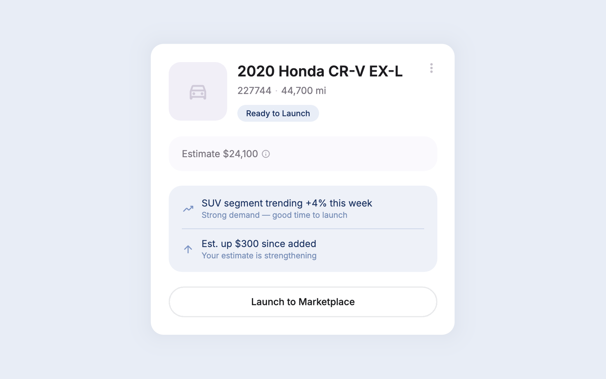
Sellers had no way to know if the market favored launching now or waiting. In the new design, every card surfaces local, recent, vehicle-specific data in real time — trust signals and timing, right where the decision gets made.
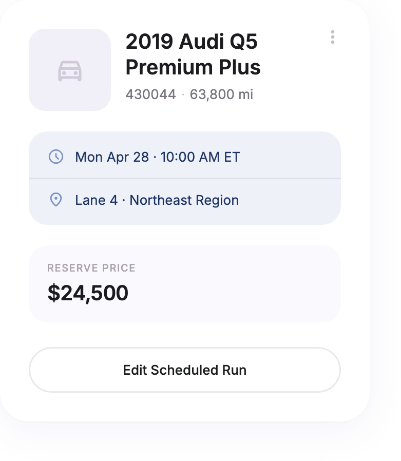
Sellers had no visibility into real bid or view interest on a scheduled vehicle, or a way to edit it. In the new design, the card shows live bid and view counts as they happen, with edits made right there — no separate tool, no waiting on a report.
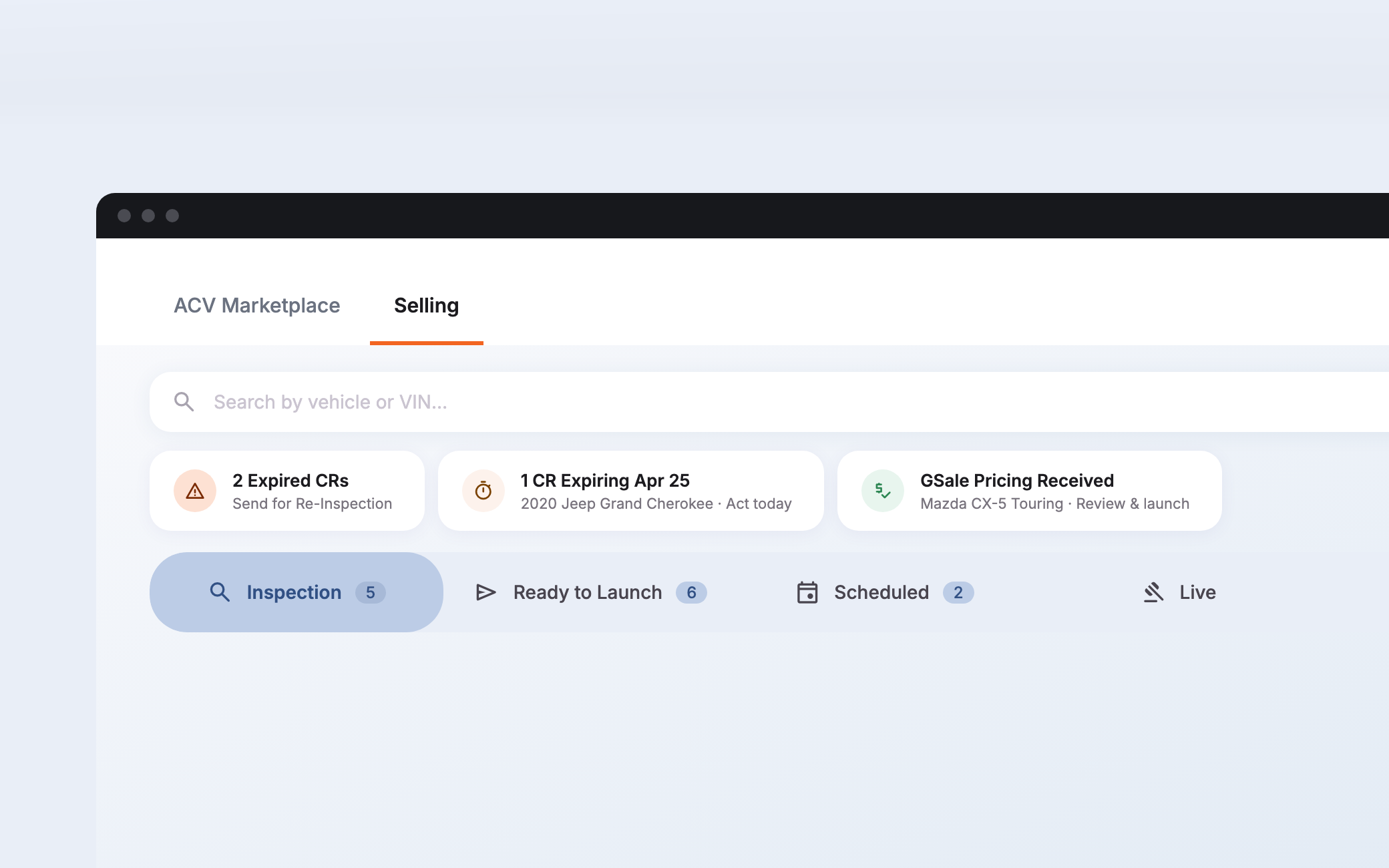
Sellers had to search the pipeline to find out what needed action right now. A strip above the pipeline surfaces it automatically instead — an expired report, pricing ready to review — each item linking straight into the right stage and filter.
Built by Frank.