The Ordinary
How our team lifted conversion through understanding user behaviour.
Project Overview.
The Ordinary is a Canadian skincare brand known for disrupting the skincare industry by providing its consumers with affordable, effective skincare. I led the research and design efforts to create a user friendly, easy to digest E-commerce Description Page, lifting page conversion to 9% (3% above the industry average).
My Role
Design Lead/Research Lead
Team
3 Designers, 3 Product Managers
Year
2022/23
The Problem.
The UX team received insights from the Customer Happiness team (CHT) regarding the Product Description Page (PDP) customer experience, citing that customers primarily came to them because they could not find the information they needed from the website. Because the CHT were busy handling simple inquiries, they were diverted from planning and tackling larger initiatives.
We took this seriously and further discovered through data & analytics that the Add to Basket rate was significantly lower than the industry average, despite sales being healthy. This showed us that folks were frustrated with the PDP but still very interested in our product line.
Before: The Ordinary’s PDP page. Participants in qualitative usability testing struggled to find the information they needed to confidently purchase products.
Current Landscape.
I wanted to get a clear picture of how our users went about discovering our product line. In order to get a better understanding of their behaviours and motivations, I conducted some valuable research.
QUALITATIVE DISCOVERY AND USABILITY TESTING
Our team interviewed 30 folks across 3 segments (new, lapsed, and repeat customers). The interviews were designed to walk customers through the current experience and determine whether or not they felt confident in purchasing the product. The team then developed metrics around the responses to inform leadership of key insights.
From here, we decided the PDP experience could be substantially improved, decreasing the influx into the CHT and raising Add to Basket conversion.
% of test participants able to locate key information on the PDP.
“All these words here (under Technology), I just skim over; it’s all a bunch of jargon.”
— Discovery Participant
Synthesis and Journey Mapping.
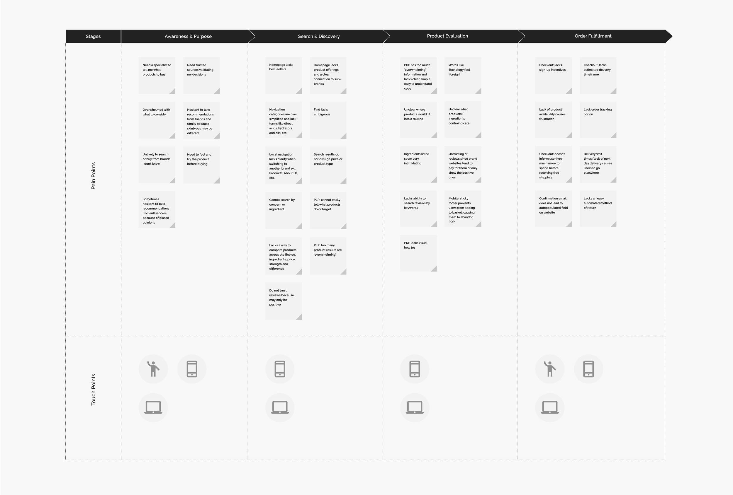
Based upon our initial discovery interviews, CHT input, and data & analytics, I held a two day workshop for our team to generate a Customer Journey Map, containing motivations, actions, pain points, and major areas of improvement (most notably, easy to skim product descriptions, usage information, contraindications, key ingredients, and how to use a product within a regimen).
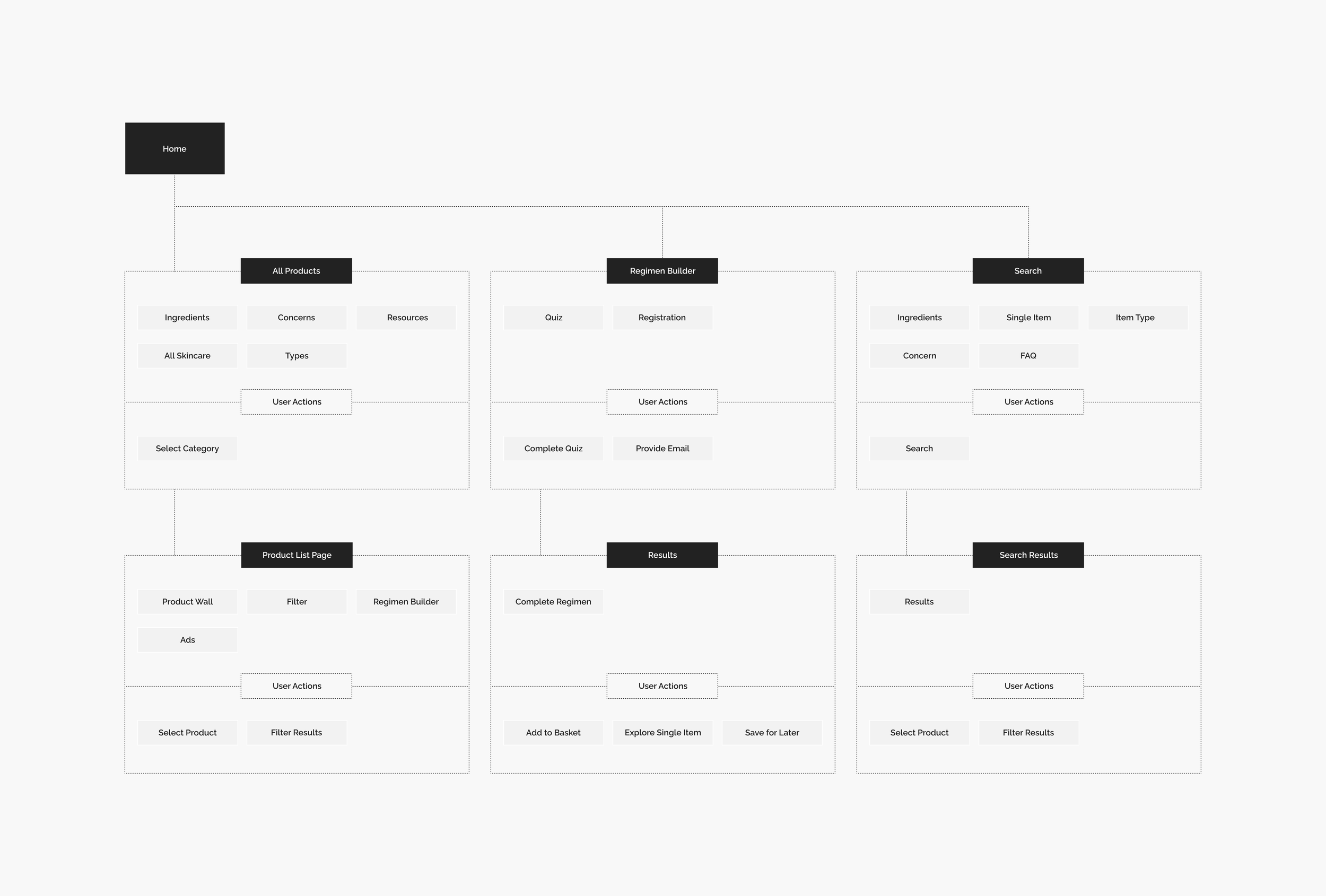
We also took a critical look at our existing sitemap and used it to optimize our customer path to purchase. We also shared out our insights with the Leadership team to align on next steps.
Customer Journey Map: version containing only customer pain and touch points.
Sitemap: Examining our existing sitemap and optimizing our path to purchase.
Wireframing Concepts.
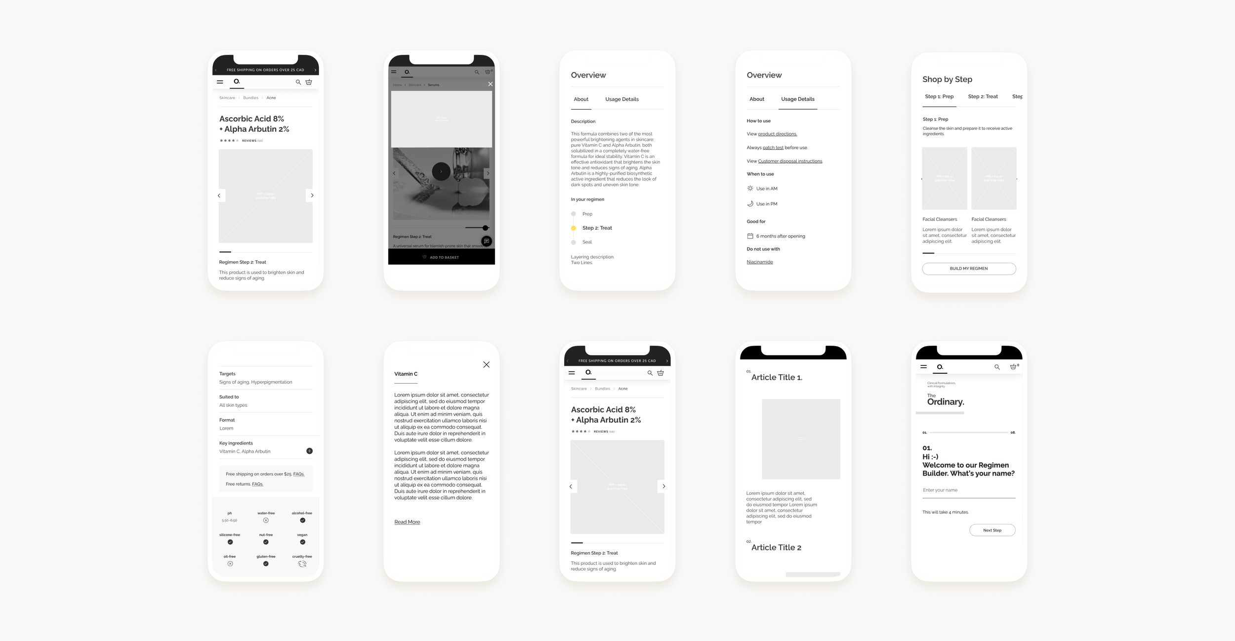
The team spent time in Figjam designing several low-fidelity designs, focusing on addressing the key pain points from our discovery sessions. Through multiple rounds of usability testing, we determined the most optimal path forward. Below is an example of the latest version from our testing rounds.
Late stage PDP Wireframes.
What we launched.
Through our rounds of usability testing and design iteration, we arrived at a PDP we were confident in launching. Below are key screens in the UX journey that directly respond to the pain points we’d discovered in our initial round of interviews.
Final PDP: mobile homepage displays additional images and how to videos (the most requested attribute in testing).
Final PDP: skincare step and most requested product attributes in testing are present.
Final PDP: key ingredients and ability to expand present; users can now learn what affects ingredients have on their skin and any ingredients to avoid.
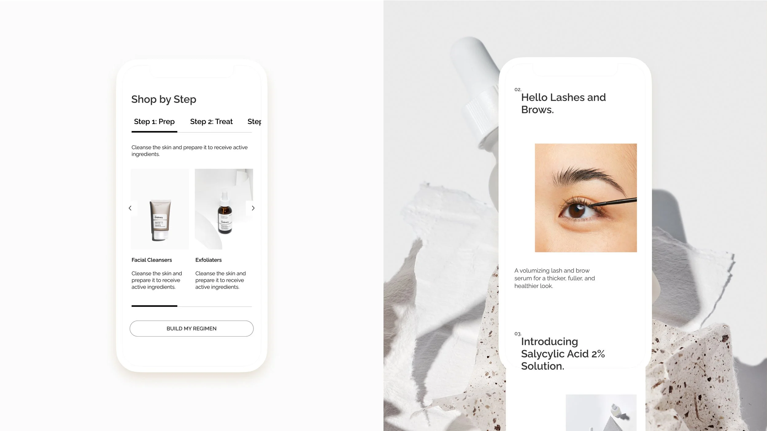
Final PDP: ability to shop by Regimen step present, with ability to expand and learn more about different areas of skincare.
The Final Results.
A VITAL INCREASE IN CONVERSION
After one month of the PDP launch, we used Google Analytics and Hotjar to track user activity. What we saw was a 9% average Add to Basket rate (6% above the old PDP and 3% above the industry average) with some of our most popular products seeing a 48% increase.
We also saw a 30% decrease in Customer Happiness requests, freeing the team to focus on strategic initiatives.
Visit https://theordinary.com/en-ca to see this incredible work in action :)


