Ceridian
Using data to connect people across their organization.
Project Overview.
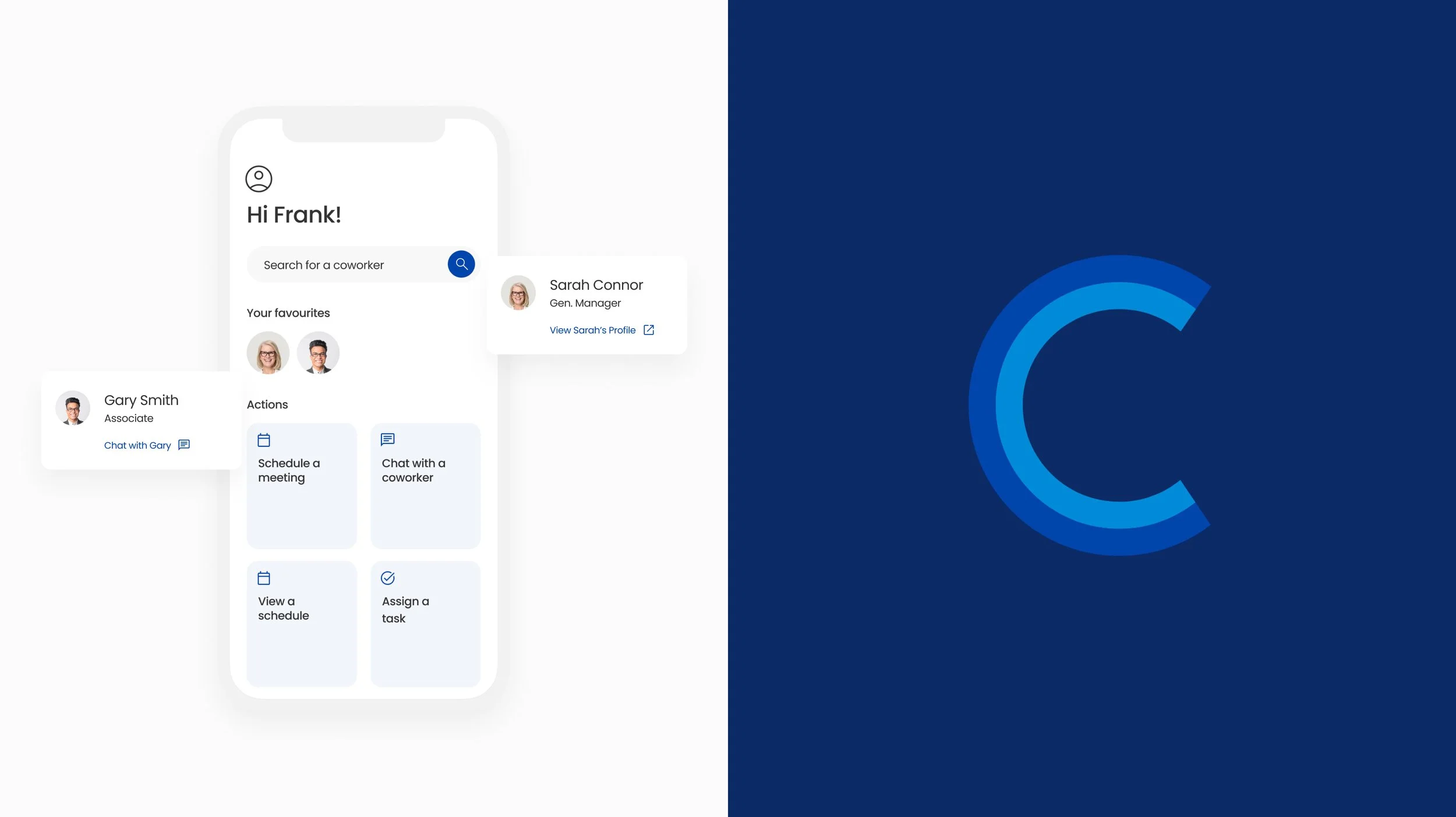
Ceridian’s Dayforce app required a new feature to help connect people across their organizations; the People Directory feature allows folks to view their colleagues within their organizational charts, schedule meetings and tasks, and chat at the click of a button.
My Role
Design Lead/Research Lead
Team
1 Designer, 1 Product Owner
Year
2020
The Problem.
As an organization, Ceridian had a lot of Human Resoures features available through their desktop application, but not to their native app user base. As hundreds of clients were adopting the Dayforce app, requests began to flood in asking for the implementation of the web’s People Directory, so that folks on the go could easily perform the same functions on the app as on desktop.
Research.
I wanted to get a clear picture of how organizations were using the desktop People Directory and discover any areas of improvement we could apply to the app. I also conducted a deeper dive into native components and how we would implement the feature across iOS and Android.
QUALITATIVE DISCOVERY INTERVIEWS AND SURVEY
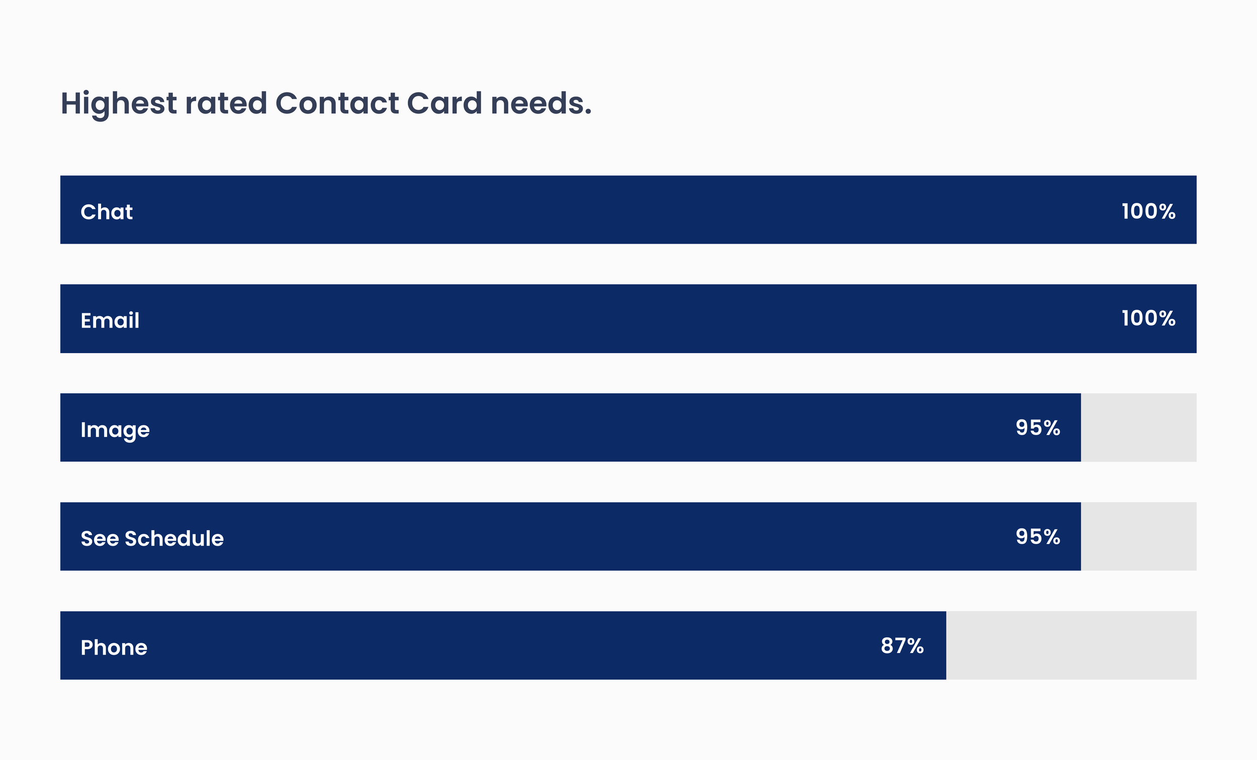
I contacted representatives from 15 brands who not only had requested the People Directory feature but were also avid users of its desktop companion. Through interviewing and survey data, I learned what users valued most about the directory and how they ranked these items by importance.
Survey data: One page from the survey showcasing users top needs for the People Directory contact card.
“I want a really easy way to chat with a coworker without having to be on my computer”
— Discovery Participant
Synthesis and Journey Mapping.
Using the survey and interview data, I held a one day team workshop (with two development teams) to create a Customer Journey map, highlighting specific areas of opportunity for the feature (most notably, searching for a coworker, viewing their schedule, contacting them, and having an interactive organizational chart).
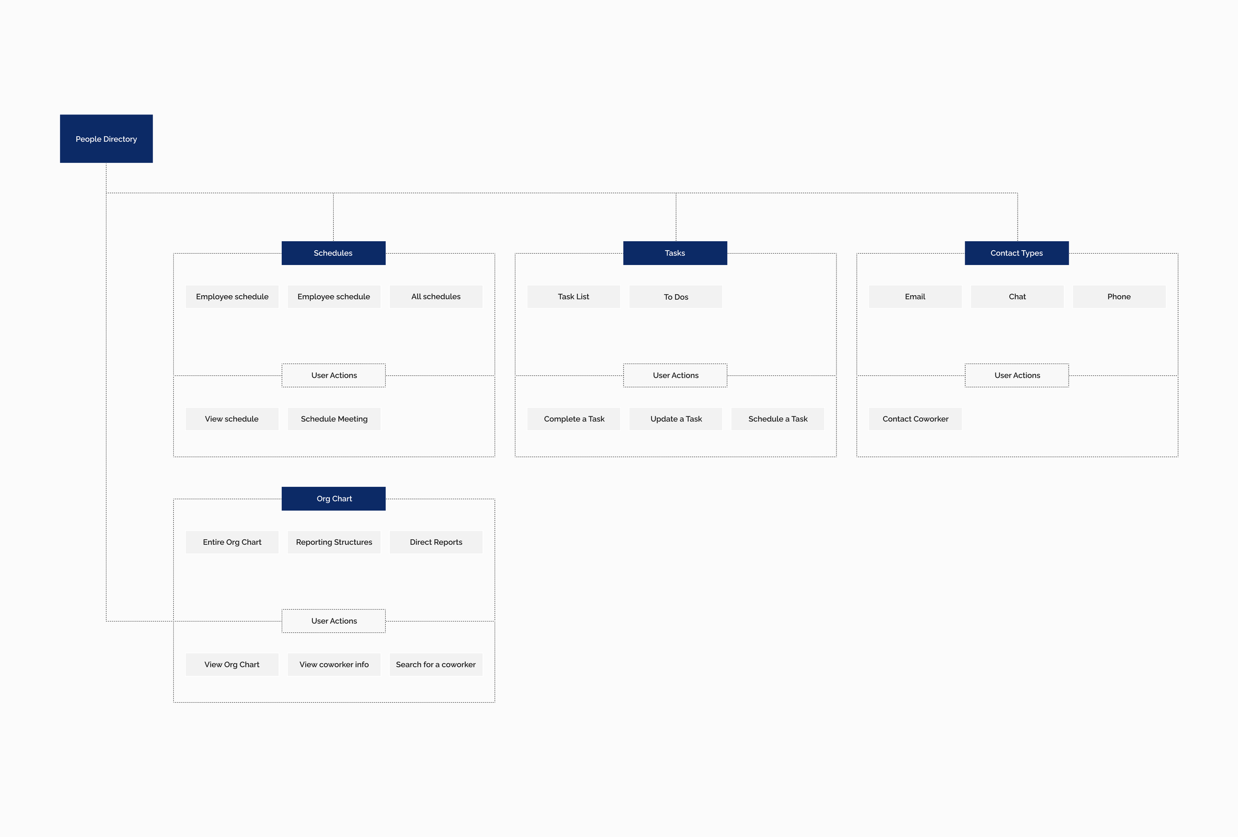
I also developed a sitemap where I highlighted key user actions when entering the People Directory feature. This allowed the development team to have a clear picture on user action types.
CX Journey Map: Highlighting key areas of opportunity.
Sitemap: Highlighting user actions from the People Directory homepage.
Prototyping and Iteration.
I hopped into Figjam with my development partners, and we began designing out potential solutions to the opportunities we’d uncovered during the research phase. I designed out two separate native prototypes and tested them across organizations in order to collect feedback, iterate, and arrive at a final destination.
Below are close-to-final wireframes with native and customized UI.
Wireframes: Design explorations showcasing Contact Card and user actions.
What we launched.
Following the wireframe, usability testing, and iteration stage, I finalized the design, ensuring both user and business needs were met and exceeded. See below for key screens.
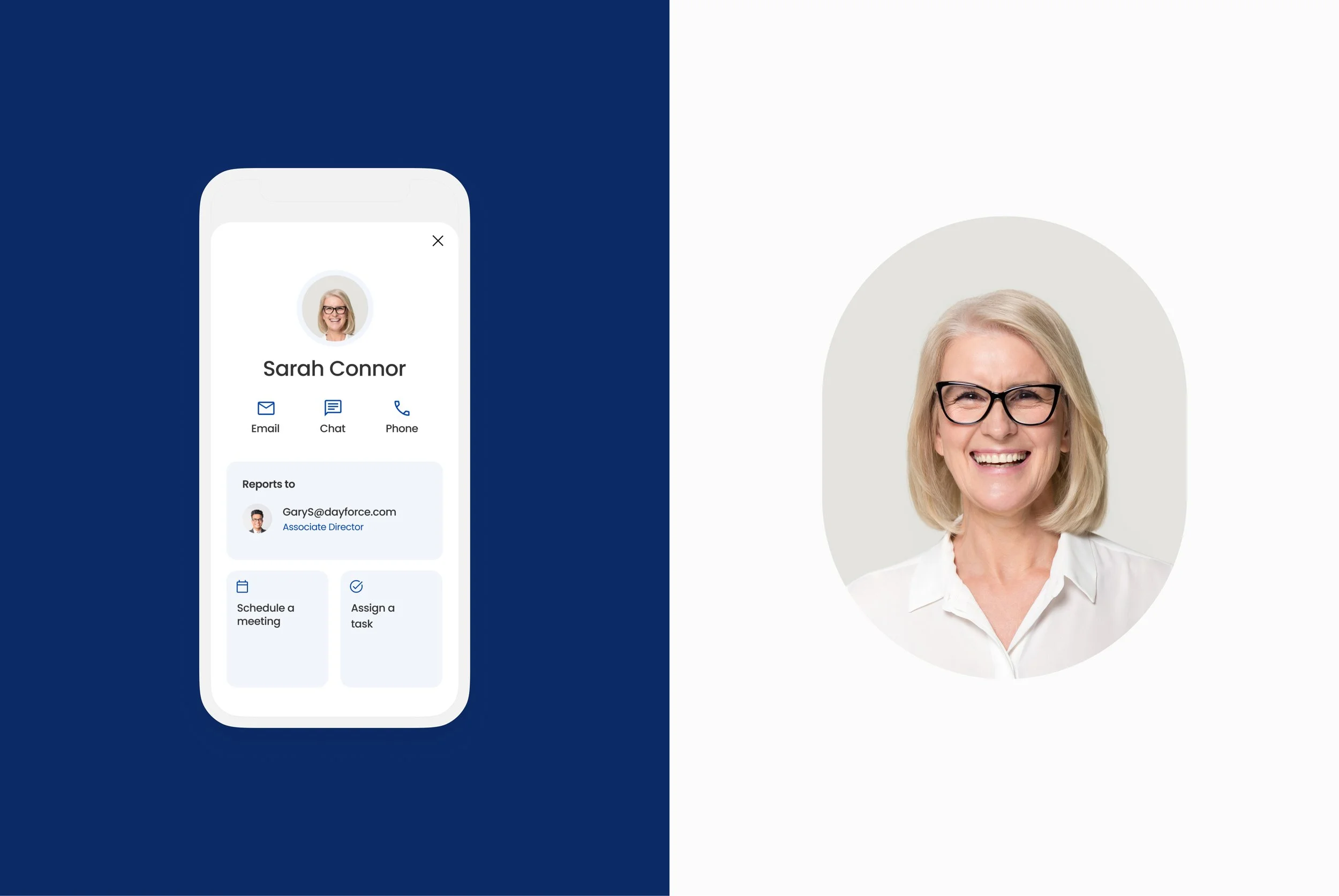
Contact Card: Card showcasing contact details, image, manager details, and key actions.
Employee Schedule: A view containing Employee daily schedule with ability to transparently view meeting details.
The Final Results.
MASSIVE ADOPTION.
Immediately after launch, 2,300 clients were now accessing and using the People Directory feature on their mobile app. We received almost a 100% success rate on the feature upon implementation and continue to iterate.
If you are using the Dayforce app, you can visit the People Directory to see this feature in action!


